Designing with Purpose: How Context Drives Creative Success

“So… where’s this going?”
It’s a question you might hear on a date, but it’s also one of the first things our creative team asks when a new assignment lands on their desk. Because for creatives, understanding creative context isn’t just helpful, it’s everything.
Will it live in a grocery aisle? On a highway billboard? Inside a social feed?
Creative doesn’t exist in a vacuum. It’s shaped by where it shows up, who’s seeing it, and what they’re doing in that moment. And when you start with the right design inputs (audience, medium, and message), that’s when creative actually works.
Keep reading for insights from the Brandience creative team on how to ensure your brand’s creative is aligned with strategy and built to perform.
The Importance of Context for Design
Before any design work begins, creatives need more than just a logo file or told they want something that looks “cool”, they need clarity. Context in design refers to the environment, audience, goals, and channels that shape how creative work should look, feel, and function. It’s the foundation that ensures design is not just visually appealing, but strategically aligned.
A strong creative brief captures this context and acts as the blueprint for design, aligning visual execution with strategic goals, audience insights, and channel context. It answers key questions like: What is the brand trying to communicate? Who is the audience? Where will the creative live?
Without these foundational inputs, even the most beautiful design can miss the mark.
Designing with Context in Mind
“Context is key. It kind of becomes the co-designer.” – Mollie Neff, Associate Creative Director
Before a single pixel is placed, our team starts with one critical question: Where will this creative live?
Designing for a distracted shopper in a grocery store is wildly different than designing for someone scrolling in bed. That’s why we treat context as a core part of the creative brief.
For example:
- Billboard: bold, fast messaging for glance-level recall
- In-store: high contrast and quick readability
- Mobile: thumb-stopping visuals and clear calls-to-action
How Does Creative Layout Change by Medium?
“Can you tell a story in one blink? That’s how I think about outdoor design.” – Matt Roettgers, Art Director
Designing across channels means rethinking layout, visual hierarchy, and storytelling structure. What works in an email doesn’t work on a billboard, and what works on a billboard doesn’t work on TikTok.
This is why designing with channel-specific strategy is part of every creative brief.
Example: Biggby Coffee
The Brandience team redesigned Biggby’s outdoor boards and digital display assets for their limited-time offers.
The OOH version enlarged the logo and simplified visuals for fast recognition.

The digital version added urgency with a “Limited Time Only” CTA
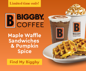
Every version told the same story, but in a way that fit its environment. Each asset prioritized the elements most critical to its context, backed by audience behavior insights and platform performance data. This ensured that whether someone was driving by or scrolling online, the message was clear, compelling, and consistent.
How Brand Awareness Shapes Design Choices
Well-known brands can afford subtlety. Think McDonald’s golden arches. But emerging brands need to build recognition with every impression.
According to studies, it takes 5–7 brand impressions before a consumer remembers a logo. Or maybe you've heard of The Rule of 7, which we explain in our blog Is Campaign Wear-Out a Myth?. For lesser-known brands, that means each touchpoint whether it’s a storefront, social ad, or direct mail, should reinforce the brand identity clearly and consistently.
Example: Heinz
In the Heinz’s “Trigger the Taste” campaign, Heinz leaned into its 150-year legacy by showcasing iconic food pairings like fries with ketchup without needing to even show the product or the brand. Instead, they used close-up visuals of foods and swapped their tagline “It Has to Be Heinz” with the complementary food item, “It Has to Be Fries”.
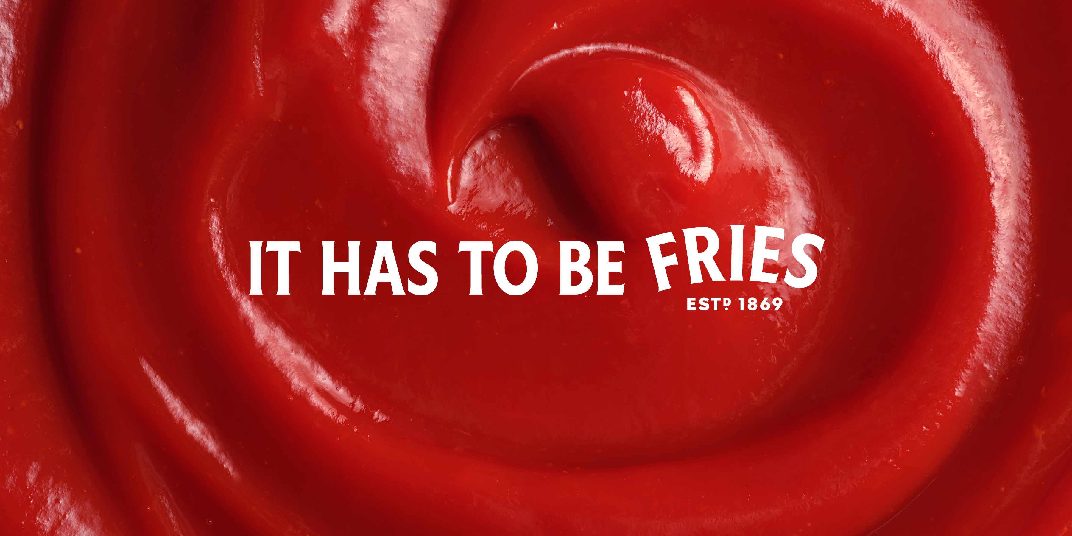
This works because Heinz has built such strong brand recognition through its visual identity and tagline that it’s instantly recognizable. For emerging brands, this kind of subtlety wouldn’t be effective. They need to clearly and consistently reinforce their brand identity at every touchpoint to build those associations over time.
Using Brand Guidelines for Design
“You have to be strong in building the framework of your brand knowing which parts are solid and which you’re willing to flex.” – Tim Hogan, VP Executive Director
Even the most flexible creative needs a strong foundation. That’s why every project starts with clear brand guidelines that act as the “brand DNA,” keeping tone, visuals, and message unified across every touchpoint.
What should your brand guidelines include?
Your brand guidelines are the foundation for consistent, strategic design across every touchpoint. Whether you're briefing an internal team or an external agency, these are the essential brand assets designers need to ensure alignment and cohesion in how your brand is showing up:
- Logo usage – Clear rules for sizing, spacing, and placement across formats
- Color palette – Primary and secondary colors with HEX/RGB values and usage guidance
- Typography hierarchy – Font families, weights, and styles for headlines, body copy, and CTAs
- Brand voice and tone – Messaging principles that reflect your brand personality
- Imagery style – Photography, illustration, and iconography guidelines
Designing for Attention
Whether it’s a banner ad or a storefront, the goal is the same: capture attention fast. That starts with visual hierarchy, the intentional arrangement of elements to guide the viewer’s eye. But hierarchy alone isn’t enough. Color contrast, typography, motion, and layout all play a role in stopping the scroll or catching the eye. To design for attention, ask:
- Is the message instantly clear?
- Does the layout guide the eye?
- Is the call-to-action easy to find?
- Does the design stand out in its environment?
Example: Aglamesis Brothers
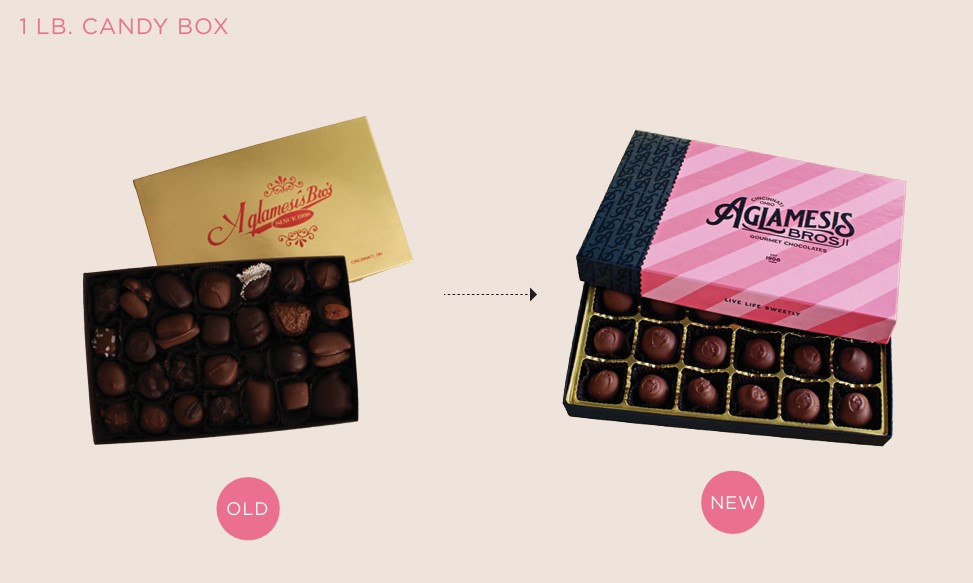
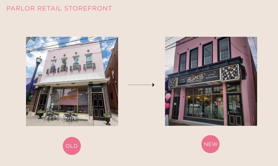
Aglamesis Brothers is a Cincinnati local ice cream stop with over a century of history. When it came time to refresh the visual identity, Brandience knew the design had to honor its legacy while inviting a new generation of customers.
Brandience refreshed the beloved ice cream brand with modern typography, bold pink stripes, and a nostalgic sketch of the founding brothers bridging tradition and modernity.
Result: An award-winning fresh identity that felt familiar and loved. Customers embraced the new look, and the updated packaging and storefront design helped Aglamesis stand out on shelves and in the neighborhood.

Bringing It All Together: Context Is Key
Creative isn’t just about making things look good, it’s about making them work. When you start with context (where it lives, who’s seeing it, and how it’s experienced) you move from pretty ads to powerful, purposeful ones.
Ready to build creative that actually connects? Talk with the Brandience team.
About the Author:
As Account Executive at Brandience, Desi Gilliland brings over eight years of experience managing marketing efforts for multiple brands, including many heritage Cincinnati brands Skyline Chili, CABVI, Aglamesis, Home City Ice, and more. Her expertise spans promotional strategy, email and social media marketing, media trafficking, and endorsement partnerships. Known for her proactive mindset and process-driven approach, Desi helps brands connect with their audiences through smart execution and creative collaboration. To connect with Desi, go to https://www.linkedin.com/in/desi-gilliland-54853459.
.jpg)
.jpg)
.jpg)
